Tang Tea Refresh 2026
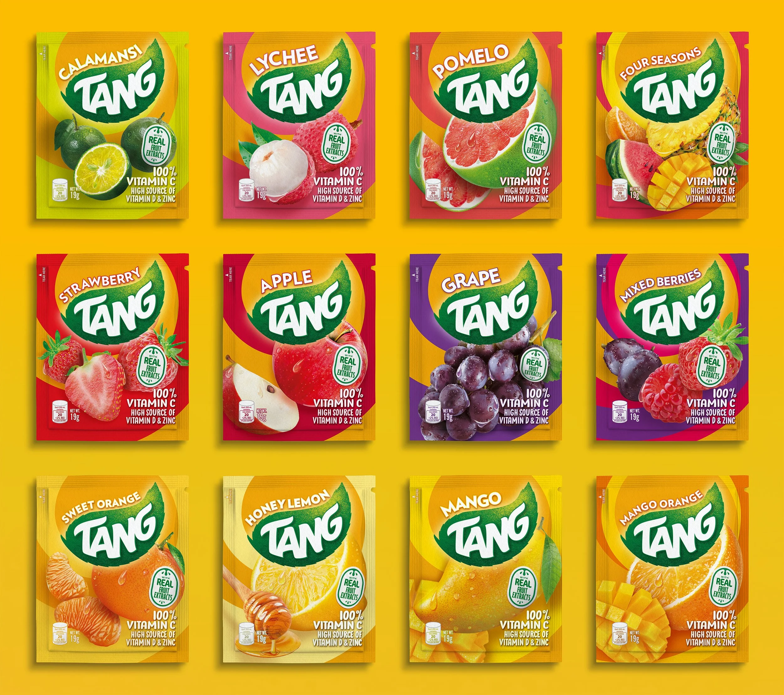
Philippines localisation of thirteen flavours based on master designs supplied by Design Bridge
Packaging Design / Image Compositing / High End Retouching / Creative Artwork
The brief
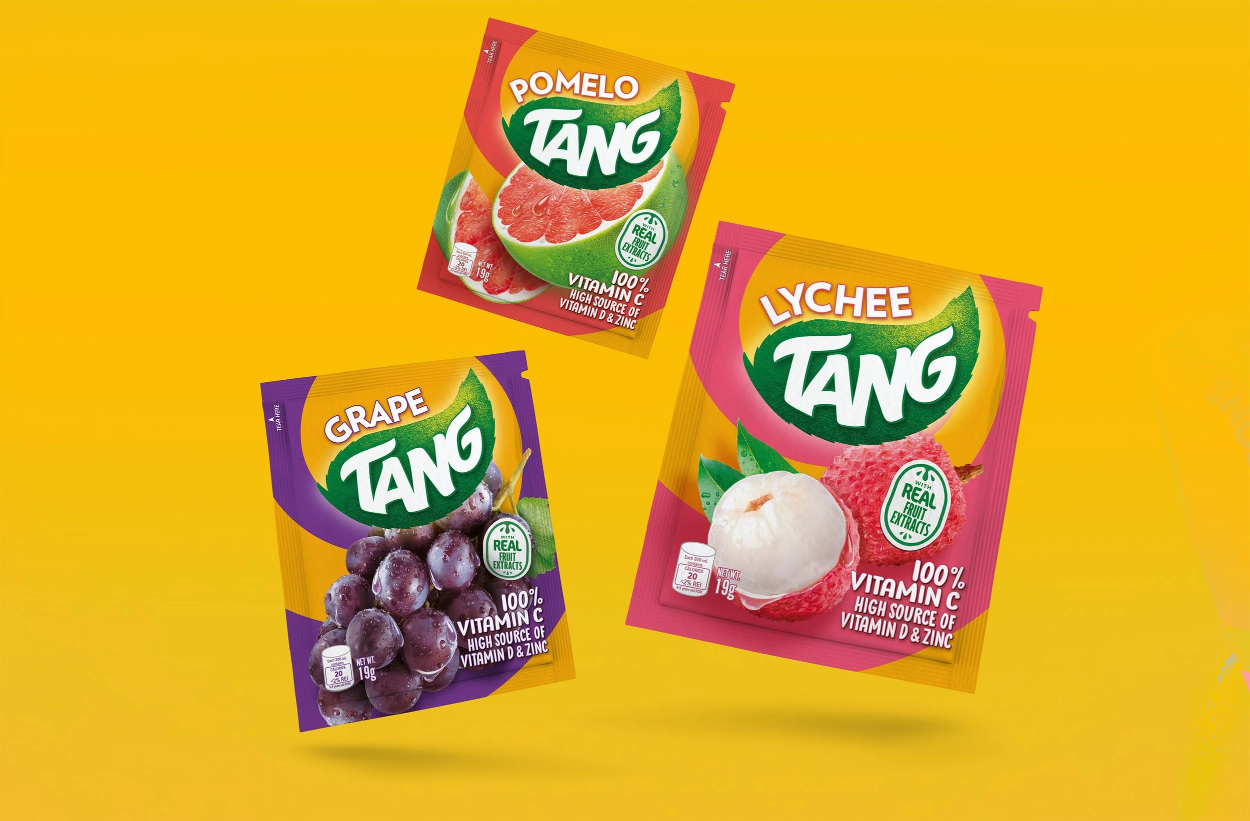
Tang is refreshing their existing product range with a fresh and colourful new look, guided by a small sample of master designs created by global agency Design Bridge. Our task is to explore how the design principles will roll out into a large range, taking particular care with differentiation of flavours with similar colour tones. The challenge? All imagery must to be comped together using stock imagery, following a dynamic layout and retouched to perfection with condensation and each fruit should accurately represent the varieties of fruit available in the Philippines.
The approach
Working from a master layout supplied by Design Bridge, my brief was to explore how the design could be adapted for a wide range of other fruits and flavours. The original design worked brilliantly for an orange to lemon flavour, but adapting it for smaller fruits and new variants required a clear set of rollout principles.
Challenge
Several flavours shared similar colour tones, so the fruit imagery would need to work hard to communicate the flavour. Smaller fruits like grapes and berries needed a new layout approach to retain the energy of the original design while ensuring the fruits were still impactful, but not too large. With a range from watermelon to grapes, and fruits varying from recognisable whole with leaves or cut in specific ways, there was a lot to consider.
Approach
I began with a flavour audit, identifying overlaps and potential confusion points. Colours were refined by referencing natural fruit tones, the actual product colours, and local market expectations. An initial fruit selection was shared with the client for approval to confirm relevance for the region.
Composition & retouching
Through collaboration with the client and tier one agency we establilshed a composition rule for the small fruits small fruits, applying a triangular composition showing three key pieces for instant recognition and balanced use of space. Once all of the images were approved, I retouched the imagery to blend realistic textures with the illustrative droplets from the master design, creating a bright, juicy finish that could be reproduced cleanly and visible on the final printed product.
Mixed Fruits
With such an overlap of flavour colours, we explored options to split the graphic swirl options, considering gradients to represent the mixed fruit colour palettes to drive differentiation. Collaboration with the local client team in the Philippines ensured colour and texture authenticity for regional fruits.
Outcome
The rollout system delivered consistency across every flavour while maintaining Tang’s bold, fresh look. Each flavour felt distinctive yet connected — with colour, composition and finish aligned across formats and markets.


